Having a responsive web means to reach more users with the same product. As we have told you in this post, “more than 55% of the world population is an Internet user. 68% comes from mobile devices, which facilitate the constant connection. That is why it’s important your company has a web to get visibility in front of those users that are daily surfing the net.”
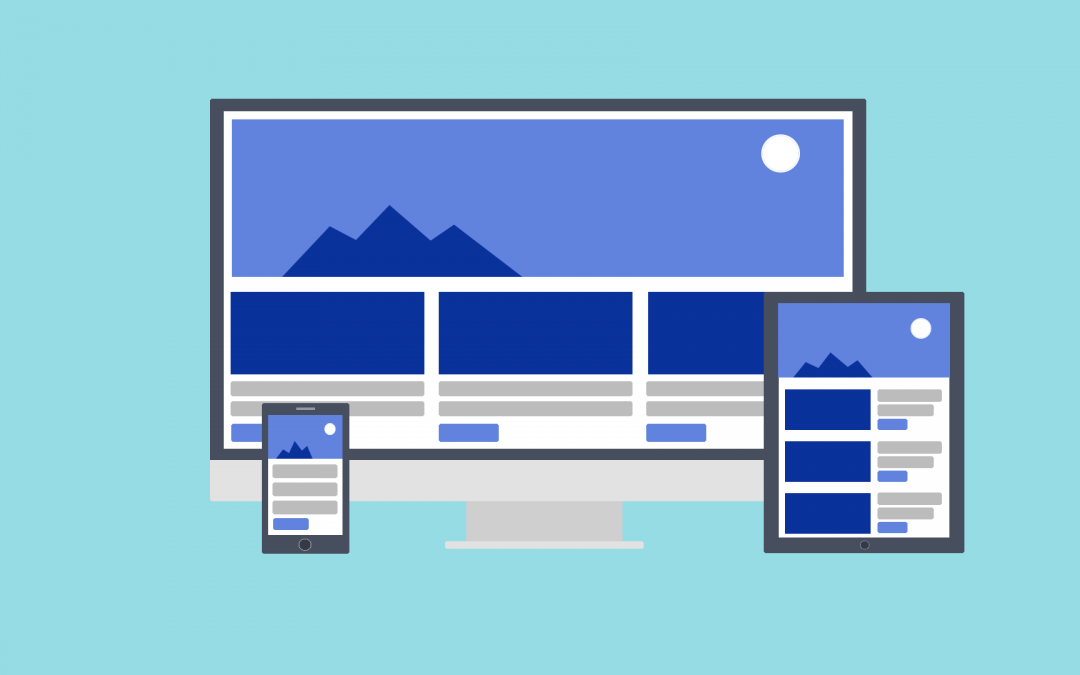
The responsiveness concept is defined as the adaptation of a digital product to every screen resolution: desktops computers, laptops, tablets, every model of smartphone, and so on. That means it is about reordering and resizing the elements that compose a web for every resolution to show them correctly and guarantee an excellent user experience.
To achieve it, it is necessary to pay special attention to the design and the layout. The key is in the HTML code (HTML5 language) and CSS or, in other words, the website structure, the elements distribution and the style these elements will have, as well as its location. So, in this kind of technological language, one of the essential points for the responsive design to work properly is to put the values as percentages. For example, width=”30%”.
A special CSS technique that is introduced in CSS3 is used for these cases: the Media Query. The aim of this technique is to include a CSS properties block as long as certain condition is fulfilled. For example, if only the screen width is 1920px, then a certain container must be shown (this is useful when there are maps which will be seen wrong or in a diffuse way in screen resolutions that are very small).
How to know if a web is responsive?
On the Screen Sizes site you will be able to see every existent screen size and every resolution. As you surely will check, there are infinities of options. Therefore, it is important that your website is completely responsive for you to reach all users who access Internet from such a wide variety of devices.
On the other hand, if you want to know how a web adapts itself to the different sizes, you have two options. First, you can position the mouse cursor on the website lateral border and reduce or increase the browser size by dragging the cursor.
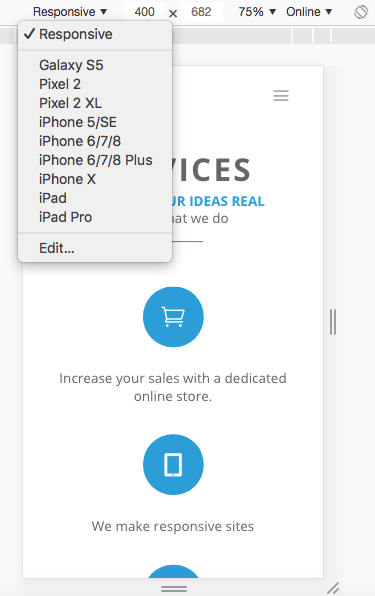
The second way is on the Chrome browser, following the actions described bellow:
1. Clic with the mouse right button on any part of the site and select Inspect.

2. Then select the Toggle Device Toolbar icon.

3. Now you can select the different devices or write the values manually to perceive how the elements adapts to the new size and are reordered.

Is your web already responsive and you can see it from any device? What are you waiting for? Remember you can ask for a quotation here to reach all those users around the world that are looking for the products and services you have to offer. Don’t stay out. Reach them and attract them to you!.
